Stretchable kashida and Arabic text justification in LaTeX
Update 2023-11-14 — Update notice on texnegar added.
Update 2021-02-20 — Editing and typo fixes.
Update 2020-09-23 — Editing and readability improvements.
Update 2018-12-11 — Commands to disable kashida added.
updates
UPDATE 2023-11-14
After this blog post was published, texnegar by Hossein Movahhedian has been made available, a package that implements the functionality described here. It builds on and improves the kashida implementation of XePersian and, according to my testing, works well with Arabic. texnegar is the recommended way of implementing stretchable kashida.
To get the functionality described below with XeLaTex, call texnegar as follows before bidi or any package that evokes it, such as polyglossia, is invoked:
\usepackage[
    Minimal=On
   ,Kashida=leaders+hrule
   ,ligatures=default
]{texnegar}
The package disables the kashida in ligatures, but this is still experimental. To switch kashida on and off, for example to protect ligatures, use \KashidaOn and \KashidaOff.
This post describes how to make stretchable pseudo-kashidas to lengthen words (كلمة طويـــــــلة) and how to automatically insert these at letter connections in order to justify Arabic text, that is, to make it have even right and left margins. The problem, solution, and the result is first presented in a non-technical way. Thereafter the implementation of the stretchable kashida in LaTeX is described.
Introduction
A paragraph with even left and right margins is said to be justified. In texts in the Latin alphabet, this is achieved in two ways: a) by hyphenating long words at the end of a line, and b) by varying the space between words.1 In the Arabic script there is no hyphenation; words cannot be broken up in two, making justification of paragraphs more difficult. What Arabic has, though, that the Latin script lacks, is the ability stretch out the connecting lines between letters. In typed text, this is done with a character called kashida (U+0640). It is a line at the baseline, similar in shape to the underscore, connecting to adjacent letters. The word كبير (kabīr ‘big’) could for instance be written with a few kashidas to make it take up more space (كبيـــــر). This can be used to justify the text.
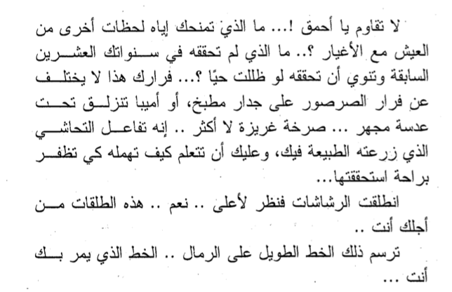
There are two problems with this. First, a line can only be lengthened by a multiple of the width of the kashida in the typeface. For example, if the kashida is 5 pts wide, the line could be lengthened by 5 pts by adding a kashida somewhere, or by 10 pts by adding two. But it could not be lengthened by 7 pts. Second, the lengthening can only be applied at certain points in certain words on the line. The lengthening cannot be evenly distributed across the line, making for an uneven appearance of the words. See for example the excerpt below from the novel Yūtūbiyā by Aḥmad Xālid Tawfīq.2 Here, kashidas have been added to the last couple of words at the end of lines to fill up the left margin. This is common practice, but it makes for an unattractive and uneven page.
Solution: the stretchable kashida
One solution to this is to use a stretchable kashida that is placed between all connecting characters. It just so happens that TeX, with its glue mechanism, provides tools to do this fairly easily and very reliably. If no stretching is needed to justify the text, the kashidas get a width of zero and do not appear at all. If some stretching is needed to fill the line (which in practice will virtually always be the case), then all these stretchable kashidas are stretched with an equal amount until the line is filled. There is thus no fixed or even default width of this kashida, it will be as long or short as it needs to be, and all stretchable kashidas on the same line will be of the same width.
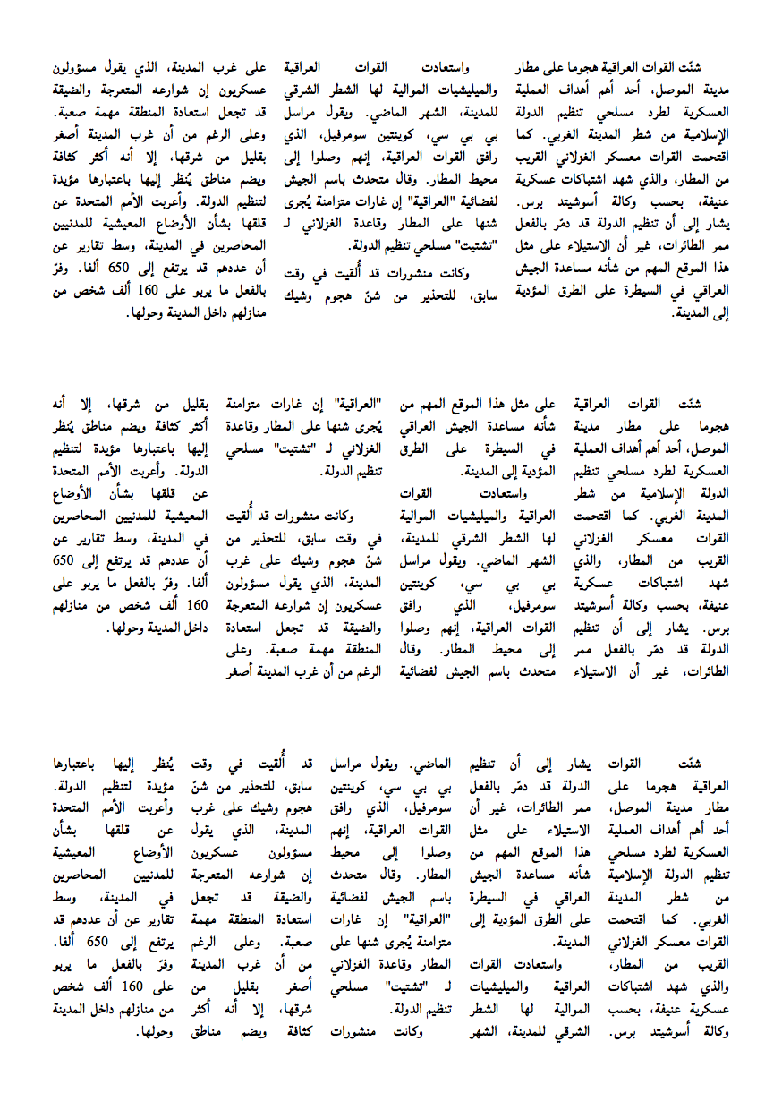
Have a look at the page below. It contains three paragraphs, taken at random from an Arabic news site. The three paragraphs are typeset three times each, first in three columns, then in four, and then in five columns. The more, and thus the narrower, the columns, the more difficult it is for the typesetting engine to find a good way of distributing words on the lines to avoid big, white spaces between words. In the last part with five columns, the text looks really bad, with large white blobs scattered all over the surface of the text.
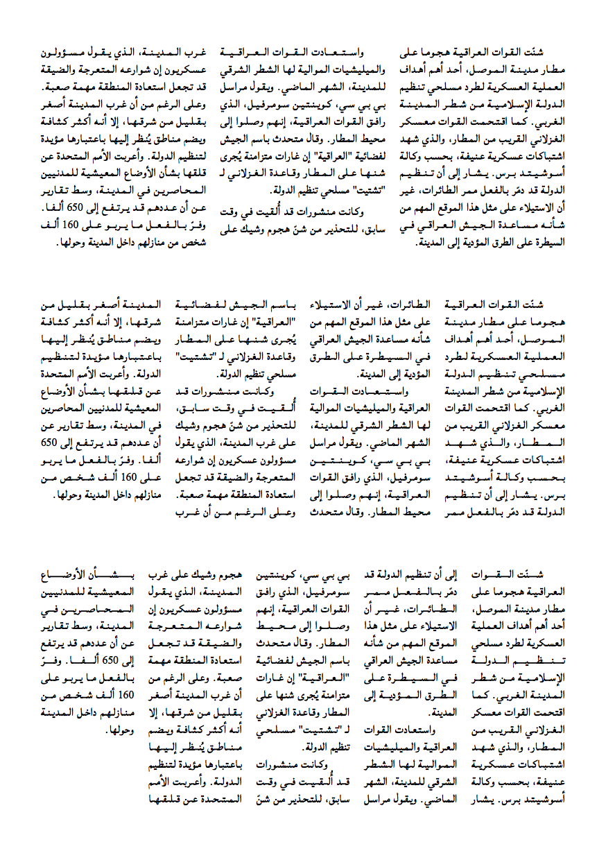
Now compare this with the following page. Here the same text is set with the same font, font size, and columns, but with a stretchable kashida at every letter connection. Note the total lack of white blobs. The stretchable kashida nicely fills every line, producing an even and attractive text surface.
The images above are PNGs and in limited resolution. Follow these links for PDFs of the example documents above with stretchable kashida and without stretchable kashida to see them in better resolution. Note that when viewing these PDFs on screen, the inserted stretchable kashida may appear choppy in certain resolutions. This is because it has not been adapted for screen display in various resolutions as has the rest of the font. This problem is specific to on-screen display and will not be an issue when the text is printed.
Application
The rest of this post is a step-by-step explanation of the LaTeX code that achieves this result. A complete self-contained example (used to produce the documents above) can be found here.
First, we load the packages that we need and setup the Arabic font. The font used here, Lateef, is free and open source, and is available here.
\documentclass{article}
\usepackage{calc} % used to measure kashida thickness
\usepackage{polyglossia}
\setmainlanguage{arabic}
\newfontfamily\arabicfont[Script=Arabic]{Lateef}
XeTeXinterchartoks
Then we activate the XeTeXinterchartoks feature, declare the different classes, and assign characters to the different classes. This allows us to automatically insert a command between combinations of characters of each class. All Arabic letters are assigned to one class with a specific set of connecting rules, i.e., those that connect to the following letter and those that do not. So between all connectors we want to insert the command for the stretchable kashida, also when a connector is followed by a non-connector, but not after a non-connector. We also need special classes for the letters lām (ل) and alif (ا, in all its variants). We do not want to insert anything between them when they appear in this order, since this would break the compulsory ligature لا. Similar exceptions for other ligatures in particular fonts could easily be added this way. Otherwise, the ligatures will simply connect at the baseline as normal when this code is applied.
\XeTeXinterchartokenstate=1

\newXeTeXintercharclass\confb % connect back
\newXeTeXintercharclass\conb  % connect front back
\newXeTeXintercharclass\alif  % alif
\newXeTeXintercharclass\lam   % lam

\XeTeXcharclass `\ي=\confb
\XeTeXcharclass `\ئ=\confb
\XeTeXcharclass `\ه=\confb
\XeTeXcharclass `\ش=\confb
\XeTeXcharclass `\س=\confb
\XeTeXcharclass `\ق=\confb
\XeTeXcharclass `\ف=\confb
\XeTeXcharclass `\غ=\confb
\XeTeXcharclass `\ع=\confb
\XeTeXcharclass `\ض=\confb
\XeTeXcharclass `\ص=\confb
\XeTeXcharclass `\ن=\confb
\XeTeXcharclass `\م=\confb
\XeTeXcharclass `\ك=\confb
\XeTeXcharclass `\ظ=\confb
\XeTeXcharclass `\ط=\confb
\XeTeXcharclass `\خ=\confb
\XeTeXcharclass `\ح=\confb
\XeTeXcharclass `\ج=\confb
\XeTeXcharclass `\ث=\confb
\XeTeXcharclass `\ت=\confb
\XeTeXcharclass `\ب=\confb

\XeTeXcharclass `\ل=\lam

\XeTeXcharclass `\ا=\alif
\XeTeXcharclass `\أ=\alif
\XeTeXcharclass `\إ=\alif
\XeTeXcharclass `\آ=\alif

\XeTeXcharclass `\و=\conb
\XeTeXcharclass `\ؤ=\conb
\XeTeXcharclass `\ذ=\conb
\XeTeXcharclass `\د=\conb
\XeTeXcharclass `\ز=\conb
\XeTeXcharclass `\ر=\conb
\XeTeXcharclass `\ة=\conb
Then we declare the combinations of character classes between which we want to insert the command for the stretchable kashida (which we have yet to define). The order of any two character classes is significant. All possible combinations of character classes where you want stretchable kashida must be added to the list.
\XeTeXinterchartoks \confb \confb = {\kashida{}}
\XeTeXinterchartoks \confb \conb  = {\kashida{}}
\XeTeXinterchartoks \confb \alif  = {\kashida{}}
\XeTeXinterchartoks \confb \lam   = {\kashida{}}
\XeTeXinterchartoks \lam   \lam   = {\kashida{}}
\XeTeXinterchartoks \lam   \confb = {\kashida{}}
\XeTeXinterchartoks \lam   \conb  = {\kashida{}}
One effect of this is that the presence of a vowel sign ( َ ِ ُ etc), shadda ( ّ ), sukūn ( ْ ), or other diacritics negate the stretchable kashida at that position. This is because the sequence of characters is then vowel sign—letter, and not one of the sequences listed above, so it will not trigger the \kashida command. You can see this in the word شنّت, the first word in the test paragraph in the examples above. This may not be a bad thing. To me, vowel or other sign and then kashida ( شــنّــت ) looks odd, and it is avoided here.
Also, in manuals of Arabic calligraphy there are rules about in what words, where in a word, and between what characters kashidas may be inserted (Benatia et al. 2006). These rules are disregarded here. I do not believe that they are particularity relevant for the modern simplified text fonts.
Kashida thickness
The following snippet uses functions from the calc package to measure the thickness of the kashida in the loaded font. It measures the top of the kashida from the baseline and stores this value in \kashidaheight. It also measure how far it extends below the baseline and stores the value in \kashidadepth. (None of the fonts I have tested this on have a kashida that extends below the baseline, so this measure will normally be 0 pts.)
\newlength\kashidaheight
\setlength\kashidaheight{\heightof{\textarabic{ـ}}}
\newlength\kashidadepth
\setlength\kashidadepth{\depthof{\textarabic{ـ}}}
This method will not give good results for typefaces in which the letter connection is raised above the baseline. This is the case with Geeza Pro, for example, a typeface included in OSX. (This could be fixed provided there is a reliable way of measuring how much the letter connections, and by extension the kashida character, is raised above the baseline.) The method presented here will, however, work fine with most simple nasx typefaces, such as Lateef, Scheherazade, and Simplified Arabic, as well as with any mono-spaced Arabic font.
Note also that these measurements will change any time the font size changes, so that the above command should be run again after any command that changes the font size. Alternatively, and preferably, any size-chinning command could be redefined to run the code below and thereby reset the kashida measurements.
\setlength\kashidaheight{\heightof{\textarabic{ـ}}}
\setlength\kashidadepth{\depthof{\textarabic{ـ}}}
Defining the kashida command
With the measurements of the kashida now stored, we can use them to define the actual stretchable kashida that is to go between all connecting characters.
\newcommand\kashida[1]{\char"200D
  \nobreak\leaders
    \hrule height \kashidaheight depth \kashidadepth
    \hskip 0pt plus 100 pt
  \nobreak\char"200D}
This produces a leader, similar to the row of dots that fills the line between a chapter title and the page number in a table of contents, for example, but it is here in the form of a solid line of kashida-thickness.
Note that the command begins and ends with \char"200D. This inserts the Unicode character ZERO WIDTH JOINER, a character that is very useful when typing Arabic. As its name suggest, it takes no space and only instructs surrounding letters to connect with it, and thus with one another. Without it, the typesetting engine would see the command \nobreak when it comes to this command, and not a letter with which the previous letter can connect, making it take the unconnected form. The command \nobreak instructs LaTeX not to insert any line break.
The heart of the command is \leaders which is a stretchable element, here declared in plain TeX. It takes two parameters:
- what it is that is to be repeated or stretched, here a horizontal rule (
\hrule) with the height stored in\kashidaheightand the depth stored in\kashidadepth - the stretchability (or ‘glue’ in TeX-terminology), here set to be able to stretch from 0 to 100 pts.
It is important that the glue is set to limited dimension, such as 100 pts, and not to infinite glue with fill, because this would mess up the last line of the paragraph which should not be filled.
The following lines provide the environment nokashida within which kashidas are disabled, and the command \nokash that takes one argument containing a word or text with disabled kashida. This is useful for the word Allah الله, for example (i.e., with \nokash{الله}), for which many fonts produce a ligature.
\newenvironment{nokashida}{\renewcommand{\kashida}{\relax}}{}
\newcommand{\nokash}[1]{\begin{nokashida}#1\end{nokashida}}
Conclusion
And that’s it. Adding the above code to the preamble automatically applies the stretchable kashida, as in the multicolumn examples above.
The way it has been applied here comes with a few caveats:
- it only works with typefaces with letters that are connected at the baseline and where the connection is not curvilinear
- if the typeface have ligatures other than lam-alif that you wish to retain, they must be added to the classes and patters of
\XeTeXinterchartoks - vowel signs and similar negate the stretchable kashida
- your may not be able to resist the urge to decorate your office wall with your new beautiful Arabic text columns
-
There is also a third method: to stretch or squeeze letters by a measure that is too small to be noticeable on individual letters but that have an accumulated effect that provides a variability used for justifying the text. See the documentation for the
microtypepackage for a discussion and implementation in LaTeX. ↩ -
أحمد خالد توفيق، ٢٠١٤. يوتوبيا، دير ميريت، القاهرة. ↩