The typography of ʿ and ʾ and a method to render them from scratch in LaTeX
In this post I describe typographical problems introduced by the characters ʿ and ʾ used in transcription of Arabic. I present a font independent (well, largely) method of rendering them in LaTeX with the XeTeX engine. The code used for this is explained in some detail and is given in its entirety at the end of this post.
Introduction
In linguistics, transcriptions of various kinds are often used to represent features and sound that are not covered in any straightforward way by the Latin alphabet. In Arabic there are a number of sounds that have no representations in the Latin alphabet, and various systems have been devised to expand the Latin alphabet in order to accurately represent them. Most of the extra characters in these systems are modifications of Latin letters. To represent the hissing sound of the Arabic letter ح, for example, linguists often use the letter h with a dot below: ḥ. Other fricatives sounds are often written with a line below a letter. To write the sound represented in the Arabic alphabet with ذ, linguists use d with a line below: ḏ. (This is pronounced with a tone, as th in the, and not as the toneless th in birth.) These modified characters are from a typographical point of view largely unproblematic. The dot below is usually the same size and shape as the full stop of the font. The line below a letter often takes the same form of the macron (¯). These modified characters are thus very simple to design with elements already present the font, and since the modifications are vertical they do not interact with neighboring letters. The letters ʿ and ʾ are, typographically, completely different and require special typesetting-attention.
The problem
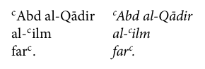
The Arabic letters (and sounds) hamza (ء) and ʿayn (ع) are transcribed as small, raised half circles, ʾ and ʿ respectively (U+02BE and U+02BF). These characters are not modifications of letters but completely new characters added to the alphabet. As such they often interact with neighboring letters in ways that type designers have not accounted for and it is accordingly not uncommon to see very poor renderings of these characters. The introduction to the popular al-Kitaab series of Arabic text books1 provides an example of how things may go wrong:
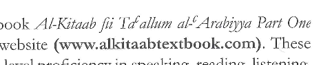
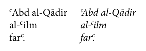
These characters typically receive little attention by type designers, which is of course understandable seeing to their very specialized use. This is particularly noticeable when it comes to kerning (spacing between letters), as in the example above. With these characters being optically very light but still taking up horizontal space they often visually split the word in two, not being able to fill up the space they occupy. In the examples below, this is particularly noticeable in Times New Roman. Gentium Plus, a free font designed to cover multiple languages, nicely solves the problem by making the symbol larger than in most other typefaces. Latin Modern Roman (which builds on Computer Modern that Knuth designed for TeX) is another free alternative with a vast range of glyphs and weights for numerous languages. It’s ʿ is in fact a superscript c.
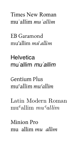
The problem I faced when writing my thesis was that I wanted to use Minion Pro, which does not have these characters in its set of glyphs. Hence the spaces in the last example above. I wanted to create this character with the superscript c, as in Latin Modern. I like this design because it gives the characters more of a visual status as proper letter, as they are in Arabic. A nice thing with the superscript font is also that it exploits the work done by the type designer to make this smaller letter optically balanced with the other characters. Taking a regular small c and shrink it down would make it too thin and light. The superscript, as also small caps, is not simply smaller, it as also proportionally thicker to give it more wight.
Writing in LaTeX, I could do this by in effect creating a new character, so that when in the source code the is a ʿ, this is printed in the text with the character the superscript c. To make the ʾ (hamza), this c should be rotated 180 degrees so that the opening faces the left.
This approach, as implemented below, has been adjusted for Adobe’s Minion Pro, but it can in be used with any font that has a superscript c, perhaps with some tweaking in kerning values. This method requires the document to be compiled with the XeTeX engine.
Making the characters
Before we start we need the following in the preamble to load the required packages:
\usepackage{ifthen}
\usepackage{fontspec}
\setmainfont{Minion Pro}
\usepackage{rotating}
\usepackage{etoolbox}
First we need the actual characters bound to commands which we call \ayn and \hamza. The ʿ is simply this superscript c. To make the ʾ we rotate the character 180 degrees around its center.2 Finally we bind these to the input characters ʿ and ʾ by changing the catcode (category code) of these characters to active, basically making them one letter commands, and defining them as \ayn and \hamza.
\newcommand\hamza{\textsuperscript{c}}}

\newcommand\hamza{%
  \textsuperscript{\rotatebox[origin=c]{180}{c}}
}

\catcode`ʾ=\active
\catcode`ʿ=\active
\defʿ\ayn
\defʾ\hamza
The characters look nice, but as you can see the kerning in the italic is pretty bad. We need to fix this.
Kerning
The space after the ʿ in the italic is too large and it sits a bit to tight on the preceding letter. In linguistic literature, transcriptions are by convention in italics, so this will usually be the form ʾ and ʿ shows up in. The kerning in the upright roman is OK for now.
We need to have different kerning in the upright and in the italic. One way to achieve this is to make a command to test for italicness, as in the following:
\makeatletter
\newcommand*{\IfItElse}{%
  \ifx\f@shape\my@test@it
    \expandafter\@firstoftwo
  \else
    \expandafter\@secondoftwo
  \fi
}
\newcommand*{\my@test@it}{it}
\makeatother
We add this to the preamble somewhere. This gives the command \IfItElse that takes two arguments. The first states what happens if the text is italic, the second what happens if it is not. By changing the commands of the new characters by placing this before and after, with different kerning in the two arguments, we can add or remove space before and after these characters in these two conditions. With the new commands below a small space of 0.02 em (two hundredths of the width of a capital M) is added before the letter, but only if it is in italic, and the space after the letter is reduced by 0.1 em., but only in italic. (It always surprises me how very small differences in spacing are clearly noticeable.)
\newcommand\ayn{%
  \IfItElse{\kern.02em}{}%
  \textsuperscript{c}%
  \IfItElse{\kern-.1em}{}%
}

\newcommand\hamza{%
  \IfItElse{\kern.02em}{}%
    \textsuperscript{\rotatebox[origin=c]{180}{c}}%
  \IfItElse{\kern-.1em}{}%
}
And this is the output:
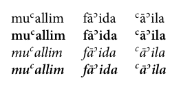
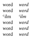
This is much better. We could stop here. But we won’t. The tricky thing with kerning is that it needs to be different for different character combinations. Look at this example, produced with the command above:
Each line here shows ʿ in combinations with characters that give odd spacing. In the first word the diagonal side of A leaves too much space. In the second the space after the hyphen below the ʿ makes the word seem disjointed. Since the Arabic definite article al is usually written with a hyphen, this combination is very frequent. In the last word the space below the ʿ makes the punctuation mark seem much too lonely.
In XeTeX, we can fix this with interchartoks. With these we can specify groups of characters (and each group may contain only one character) and have a command automatically inserted between specific character groups whenever they are in direct succession. This can be exploited for kerning of specific character combinations.
First we need to turn on this feature with \XeTeXinterchartokenstate=1. We then declare the three different groups we need with \newXeTeXintercharclass and assign characters to each group with \XeTeXcharclass. (Note that Ā is included in the same group asA, and , as the same group as . since these give rise to the same problem and need the same kerning.)
\XeTeXinterchartokenstate=1

\newXeTeXintercharclass\punct
\XeTeXcharclass `\.=\punct
\XeTeXcharclass `\,=\punct


\newXeTeXintercharclass\capA
\XeTeXcharclass `\A=\capA
\XeTeXcharclass `\Ā=\capA

\newXeTeXintercharclass\hyph
\XeTeXcharclass `\-=\hyph


\newXeTeXintercharclass\aynhamza
\XeTeXcharclass "FEFF=\aynhamza % hamza and ayn
The last class here is where things get tricky. We now need to assign a character class to our newly created ʿ and ʾ. The problem is that XeTeX will not see ʿ and ʾ but the c in the underlaying code that renders them. And we do not want this kerning also to apply to the cA combination. So we can’t assign c to this class. One of the wizards at TEX.SE came up with this solution: we include in the commands generating our new characters a Unicode character that takes no space and that is unused. Enter U+FEFF, aka zero width no-break space. We put this at the beginning and the end of the character commands, with a somewhat odd annotation:
\newcommand\ayn{%
  ^^^^feff%
  \IfItElse{\kern.02em}{}%
    \textsuperscript{c}%
  \IfItElse{\kern-.1em}{}%
  ^^^^feff%
}

\newcommand\hamza{%
  ^^^^feff%
  \IfItElse{\kern.02em}{}%
    \textsuperscript{\rotatebox[origin=c]{180}{c}}%
  \IfItElse{\kern-.1em}{}%
  ^^^^feff%
}
Now what LaTeX (really XeTeX) will see when it comes across a ʿ in the input file is something like
[U+FEFF]c[U+FEFF]
We can then assign FEFF to a XeTeX character class to represent ʿ and ʾ, as is done in the last \XeTeXcharclass in the declarations above.
We now declare kerning commands to be inserted between these combinations of character classes. Note that you need to be explicit about the ordering of character classes and that different orderings may have different results.
% ʿ/ʾ then A
\XeTeXinterchartoks \aynhamza \capA ={\kern -.1em}
%  A then ʿ/ʾ
\XeTeXinterchartoks \capA \aynhamza ={\kern -.1em}

% ʿ/ʾ then ./,
\XeTeXinterchartoks \aynhamza \punct ={\kern -.15em}

% - then ʿ/ʾ
\XeTeXinterchartoks \hyph \aynhamza ={\kern -.05em}
% ʿ/ʾ then -
\XeTeXinterchartoks \aynhamza  \hyph={\kern -.05em}
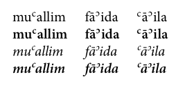
Now the output looks like this:
Much better. Just applying these kernings will improve the text considerably. There are however many more combinations of ʿ and ʾ with other characters that would need its own kerning values. You can add kerning as they show up in the text.
Alignment in tabular environments
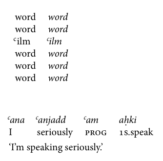
Another typographical problem with ʿ and ʾ is that they look odd when they are the first letter in word appearing in a list or a similarly aligned environment. The space beneath a word-initial ʿ and ʾ makes the word look indented. This problem appears in many lists of Arabic words or names:
In linguistic literature this also often shows up in glossed examples since the transcription is aligned with the translation:
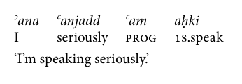
This may by matter of taste, but it really annoys me, especially with ʾana being aligned to I. Articles in linguistics will often have dozens of such examples, so it really builds up quickly.
What we want here is the ʿ and ʾ to protrude slightly to the left to get a better optical alignment. Any automatic solution to this would be tricky.3 What I’ve done in these cases is simply to write custom command instead of ʿ and ʾ. These command names are best kept short since you might have to write them a lot. Keeping them short also makes the readability of source code suffer as little as possible. We can define \la (left ʿayn) and \lh (left hamza) to use in these situations:
\newcommand*{\la}{\hspace*{-.2em}ʿ}
\newcommand*{\lh}{\hspace*{-.2em}ʾ}
These prints the appropriate character but with a small negative space of 0.2 preceding them, pulling them slightly to the left. And we get something much prettier:
Conclusion
The characters ʿ and ʾ are in many otherwise either absent or poorly designed. This post has described a way of creating them from scratch in LaTeX. This method has the advantage of being in principle font independent, provided that the font has a superscript c. (I have used it with Source Sans Pro to great effect with these exact same kerning values but have not tested it with other fonts.) It takes elements present in the font and modifies them to make the new characters.
There is one problem with this approach that I have not yet solved. In the pdf output the character renders as expected but it is internally represented as c, so if you copy the word muʿallim from the pdf you get mucallim. I might come back here and add a fix once I figure it out.
Complete code
The code below can be added to the preamble without any further modifications the document to have these kerning applied. It also provides the \la and \lh commands for use in tabular environments as described above.
\usepackage{ifthen}
\usepackage{fontspec}
\setmainfont{Minion Pro} % or other font with a superscript c
\usepackage{rotating}
\usepackage{etoolbox}

\newcommand\ayn{%
  ^^^^feff%
  \IfItElse{\kern.02em}{}%
    \textsuperscript{c}%
  \IfItElse{\kern-.1em}{}%
  ^^^^feff%
}

\newcommand\hamza{%
  ^^^^feff%
  \IfItElse{\kern.02em}{}%
    \textsuperscript{\rotatebox[origin=c]{180}{c}}%
  \IfItElse{\kern-.1em}{}%
  ^^^^feff%
}

% Bind to Unicode chars and robustify
\catcode`ʾ=\active
\catcode`ʿ=\active
\defʿ{\ayn}
\defʾ{\hamza}


\robustify{ʿ}
\robustify{ʾ}

% Test for italicness
\makeatletter
\newcommand*{\IfItElse}{%
 \ifx\f@shape\my@test@it
   \expandafter\@firstoftwo
 \else
   \expandafter\@secondoftwo
 \fi
}
\newcommand*{\my@test@it}{it}
\makeatother


% Kerning with XeTeX
\XeTeXinterchartokenstate=1

\newXeTeXintercharclass\punct
\XeTeXcharclass `\.=\punct
\XeTeXcharclass `\,=\punct


\newXeTeXintercharclass\capA
\XeTeXcharclass `\A=\capA
\XeTeXcharclass `\Ā=\capA

\newXeTeXintercharclass\hyph
\XeTeXcharclass `\-=\hyph


\newXeTeXintercharclass\aynhamza
\XeTeXcharclass "FEFF=\aynhamza % hamza and ayn

% ʿ/ʾ then A
\XeTeXinterchartoks \aynhamza \capA ={\kern -.1em}
%  A then ʿ/ʾ
\XeTeXinterchartoks \capA \aynhamza ={\kern -.05em}

 % ʿ/ʾ then ,/.
\XeTeXinterchartoks \aynhamza \punct ={\kern -.15em}

% - then ʿ/ʾ
\XeTeXinterchartoks \hyph \aynhamza ={\kern -.05em}
% ʿ/ʾ then -
\XeTeXinterchartoks \aynhamza  \hyph={\kern -.05em}

% Commands for left protruding hamza and ayn when
% word inital in tabular envs.
\newcommand*{\la}{\hspace*{-.15em}ʿ}
\newcommand*{\lh}{\hspace*{-.15em}ʾ}
-
Brustad, K., Al-Batal, M. & al-Tunsi, A., 2011. al-Kitaab fī Taʿallum al-ʿArabiyya: A Textbook for Beginning Arabic, Washington, D.C.: Georgetown University Press. ↩
-
Another option is to mirror it. This would have the benefit of keeping the rounded end of the pen stroke in the upper part, keeping the design of the glyph. By rotating it we are basically reversing the troke, which is not not esthetically optimal. However, by rotating rather than mirroring it we make sure that it keeps its exact slant in the italic. Mirroring it makes it lean to left rather then the right, which of course will not do. ↩
-
Partial sucess: http://tex.stackexchange.com/questions/176335/alignment-of-arabic-transcriptions-%CA%BE-and-%CA%BF ↩