Writing plots in plain Tikz
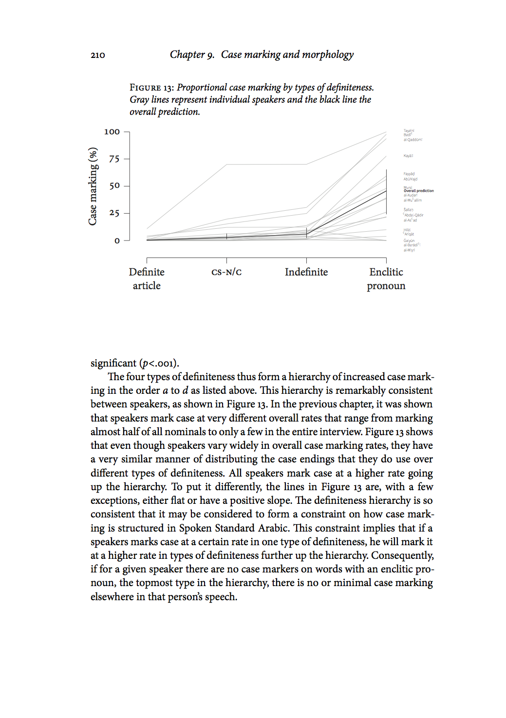
The quality of plots and graphs in academic publications is often poor. Typically, a plot is generated in some program and is simply pasted into the final document with fonts and a graphical characteristics that do not match the rest of the document. Here I describe a fairly easy and straight forward way of writing simple plots in Tikz in LaTeX documents. It allows for fine control of the output and an easy way to make us global document settings also inside the plots. This description is meant only to give the basic framework of how to rite plots this way, a proof of concept if you will. There are many ways to improve it and streamline the code. It is the method I used to generate the plots in my thesis, such as the one in page 210:
Tikz is an extension of LaTeX (as well of other TeX-derived languages) specialized in describing and producing technical graphics. (For a good short introduction to Tikz check out A very minimal introduction to TikZ.) Below I describe how to
- set up a coordinate system that matches the structure of the data
- draw the axes
- define functions for plotting data as points or lines
- add the data in the form of these functions
A self-contained example can be found at the end of this post.
The design of these plots aims to get a high ink-to-information ratio, as defined by Edward Tufte in The Visual Display of Quantitative Information (Graphics Press, 2001). That is, every use of ink in the plot should convey some piece information. If it does not, if it is mere decoration, it should be removed. These plots are not as radical as some of Tufte’s most minimal designs. I have for example retained the axis lines, which I feel are needed to visually delimit the plotting area since I have no grid or background color that would otherwise define it. Still, these plots are fairly sparse, with little graphical redundancy.
Some words on pgfplots. pgfplots is a popular higher level language for plotting based on Tikz/pgf. I do not use it. I never got into it. I like the direct control that plain Tikz provides. And also I just didn’t want to learn how to navigate the pgfplots documentation, which would. A lot of people like pgfplots, however, and it is probably faster once you learn it properly, especially if you do a lot of more complicated plots. I suspect though that using pgfplots would make it quite a bit more tricky to get some finer details exactly the way you want them. Also, if you have learned the basics of Tikz, setting up your own system for plot writing is quite simple, as I hope to demonstrate in this post.
Setup
First we need specify some lengths in the preamble of the LaTeX code. These lengths are to be the same in all plots so as to give coherent feel. Note for example that every plot is to be have same size relative to the page layout: one fifth of the height of the text block and a little more than two thirds of its width. By specifying the lengths this way, they conveniently scale to different page sizes if you change it later. These values are a matter of taste and can be changed at any point. They can also be overridden locally for a specific plot with the \setllength command.
\usepackage{tikz}
\usepackage{calc}
\usepackage{kantlipsum} % for placeholder text

% lengths for tikz plots
\newlength\plotdataheight % Height of plotting area
\setlength\plotdataheight{.2\textheight}
\newlength\plotdatawidth % Width of plotting area
\setlength\plotdatawidth{.7\textwidth}
\newlength\axissep % Space between plotting area and axis
\setlength\axissep{1em}
\newlength\tickl % Length of minor ticks
\setlength\tickl{2mm}
\newlength\ltickl % Length of major ticks
\setlength\ltickl{3mm}
\newlength\ylabsep % space between plotting area and y-label
\setlength\ylabsep{\axissep+\tickl+1.5em}
\newlength\xlabsep % space between plotting area and x-label
\setlength\xlabsep{\axissep+\tickl+1.5em}
The basic framework for each plot is as follows. Before each plot we specify some variables for that particular plot, namely the minimum and maximum values of the x- and y-axes in (these can be negative values) and the axis labels. These typically represent the independent and the response variables.
\def\maxy{100}%
\def\miny{0}%
\def\maxx{3}%
\def\minx{0}%
\def\xlab{Definiteness}%
\def\ylab{Case marking (\%)}%
On the line directly following this we start the tikzpicture environment where we do the actual drawing. The code is explained below.
\begin{tikzpicture}[
    y=\plotdataheight/(\maxy-\miny)
    , x=\plotdatawidth/(\maxx-\minx)]

    \useasboundingbox
        (\minx,\miny) ++
        (-\axissep,-\axissep-\tickl-\xlabsep)
        rectangle (\maxx,\maxy);

% y-axis
\draw (\minx-\axissep,\miny) -- (\minx-\axissep,\maxy);
% y-ticks
\foreach \x in {\miny,25,...,\maxy}
    {\draw (\minx,\x) ++ (-\axissep,0) -- ++ (-\tickl,0)
% y-tick labels
	    node[anchor=east] {\x};}
% y-label
    \path  (\minx-\ylabsep, {(\miny+\maxy)/2}) node[align=center, rotate=90 ,anchor=south] {\ylab};

% x-axis
\draw (\minx,\miny) ++ (0,-\axissep) -- ++ (\maxx,0);

% x-ticks
\foreach \x/ in { 0, 1, 2, 3 }
    \draw (\x, \miny) ++ (0,-\axissep) -- ++ (0, -\tickl);
% x-tick labels
      \node at (0,-\axissep-\tickl) [align=center,anchor=north ] {Definite\\article};
      \node at (1,-\axissep-\tickl) [anchor=north] {\textsc{cs-n/c}\vphantom{I}}; % \vphantom to align
      \node at (2,-\axissep-\tickl) [anchor=north] {Indefinite};
      \node at (3,-\axissep-\tickl) [align=center,anchor=north ] {Enclitic\\pronoun};

      % <----- Definitions of plotting command(s) go here.

      % <----- Plotting commands go here.

\end{tikzpicture}
We utilize the max and min values defined above to get a coordinate system that matches the actual data. This means that we can draw it directly using actual data values as coordinate. One unit in the y-axis equals \plotheight (defined in the preamble as describe above) divided by the span of the y-axis (max value - min value). These values are usually known or easily retrievable from the data. Since in this example we want to plot percentages in the span of 0–100, one unit on the y-axis is one hundredth of the total plot height, which in turn is one fifth of the height of the text block on the page. Thus, we can feed in percentage data directly as a y-coordinate and it will be plotted accordingly. This example of 0–100 is of course very simple, but is works just as good if we have a y-span of, say, 36–285. The same thing is done for the x-axis. In this example, the x-axis has non-numerical data of four levels, 0–3 (including zero).
The \useasboundingbox delimits the box that TeX identifies for alignment purposes. With this command the plot is centered on the area encloses by the axes lines, ignoring the label and the numbers for the y-axis. This makes the plot optically centered on the plot rather than logically centered as a complete graphical object with labels and all. The two images below illustrate the difference. The image on the left is logically centered, and the one to the right is optically centered using the boundingbox. The red box shows the area that TeX is centering.
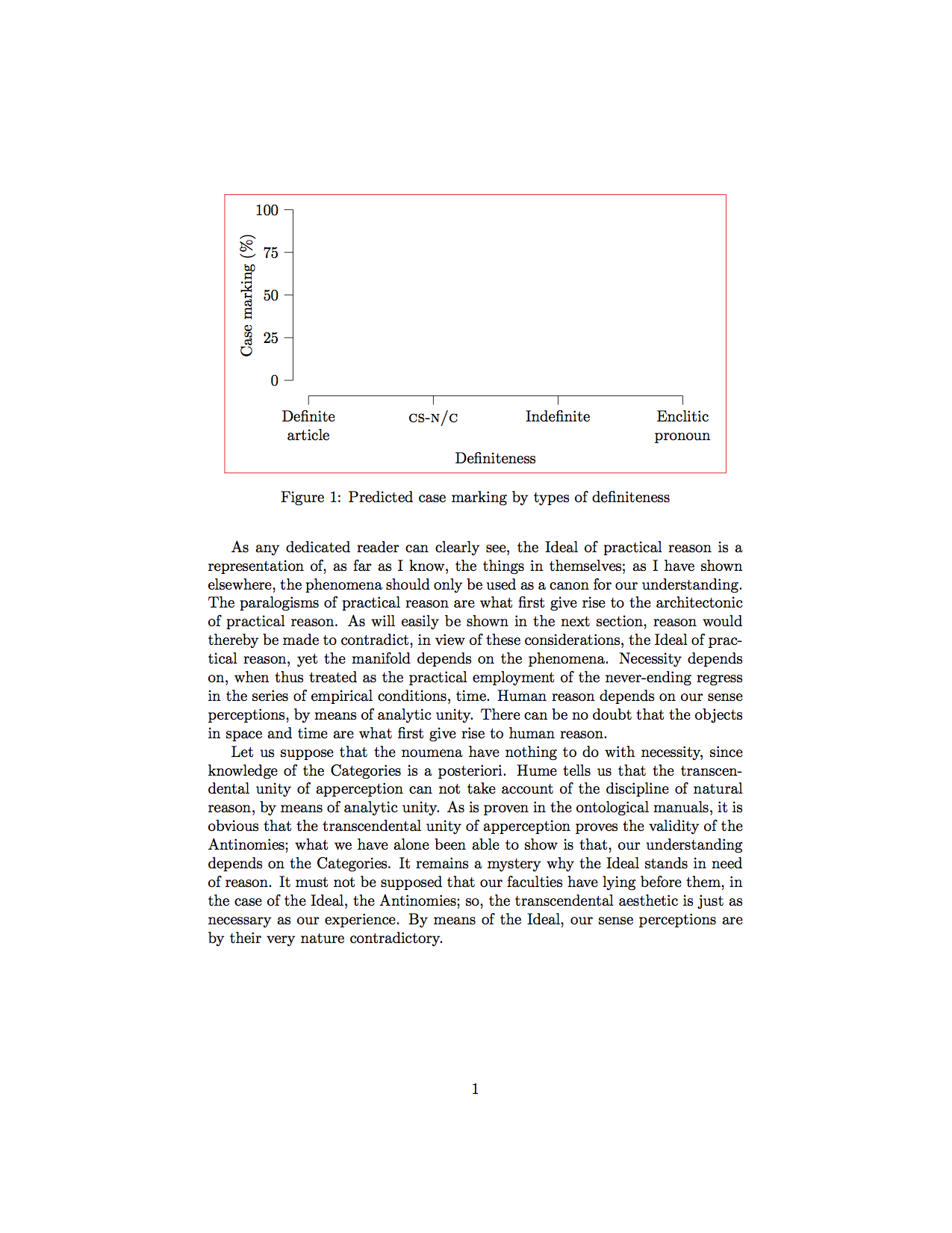
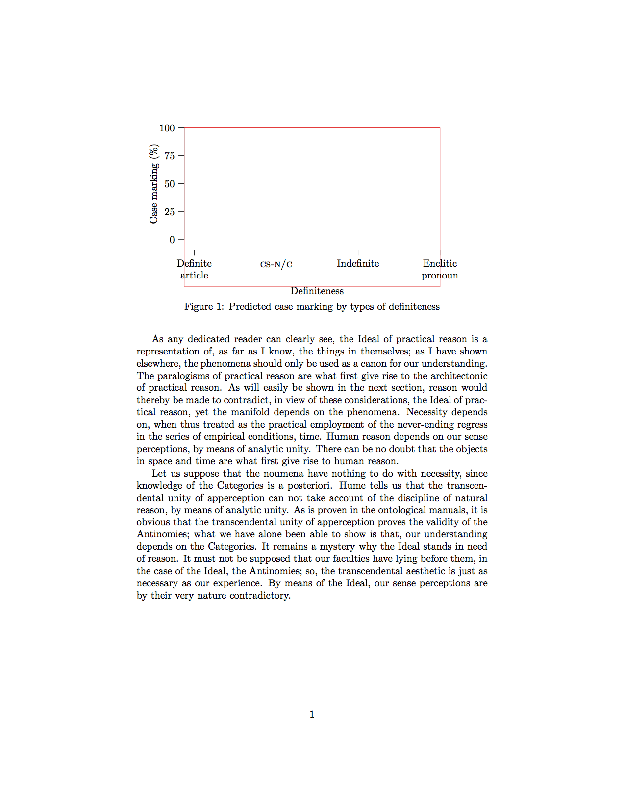
The difference is subtle in this example, but if you have labels sticking out the sides, as in the page from the dissertation shown above, the effect is more noticeable. This page also shows the second effect of the boundingbox, namely that the caption becomes aligned with the y-axis of flush left, rather than with the y-axis label on the far left.
The next set of commands draws the x and y-axes, ticks, labels for ticks, and labels for the axes using the lengths defined in the preamble. Thus, the axes are \axissep (1em) away from the plotting area, making the plot less cramped and giving some space for data points at the very edge of the area. This is a matter of taste. You could for example set this length to zero with \setlength\axissep{0pt} to have the axes lines exactly on the edge of the plotting area, which is quite common. I find that the plotting area needs some extra room to breath and prefer to give it this extra space.
The one thing that may be tricky here is the for loop to draw the axis ticks. For the y-axis I have it loop over \miny,25,...,\maxy. This tells Tikz to start at the minimum y-value (0), do one step to 25, then do steps of equal lengths till it gets to the maximum y-value (100), giving four values. These could just have been type out like this 0,25,50,75,100. For each of these the commands draw a tick and prints the value that the tick represents.
Note also that the tick labels on the x-axis are anchored to the north (top) of the box containing the text, making them top aligned by the tallest letter in each box. This means that if one of them has no ascending characters, such as in the small caps in CS-N/C in our example, but the others have, this shorter label will not be aligned with the others but will be slightly lifted up. To avoid this we add \vphantom{I} in the shorter label (or in all the labels). This places and invisible object there that has zero width but that is as tall as the letter I, making TeX having them align by this tall, invisible letter.
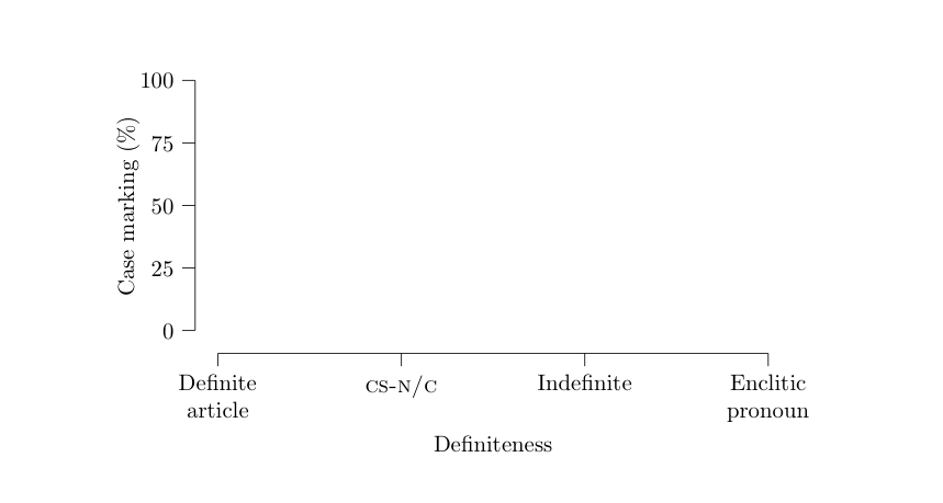
Now we have the following, which is to be filled with data.
Entering data
This is where it all comes together. We want to fill this axis-delimited area with some graphical element, typically dots or lines or a combination of the two, to visualize our data. Because of the way we set up the coordinate system of the plot we can use the numbers from the data directly as coordinates in the plot, making it very simple to write a command that plots our data for us.
The trick here is to take tabular data outputted from your favorite statistics software and turn it into LaTeX commands. For example, let’s say we have some csv-data that looks like the table below, where every line is the rate at which one speaker uses a specific grammatical ending in the four different grammatical environments definite.article, cs.nc, indefite, or enclitic.pronoun.
definite.article,cs.nc,indefinite,enclitic.pronoun
10.800,70.000,70.149,99.999
2.967,15.277,24.902,97.826
0.809,19.718,30.496,93.750
4.072,12.121,12.413,56.249
0.684,4.081,13.872,47.999
We remove the column headers, they are not data, and then with some simple substitutions in our favorite text editor we can turn this the into a set of LaTeX commands, arbitrarily named \plotdata.1 In this example, the command was four arguments since there are fore levels in the independent variable.
\plotdata{10.800}{70.000}{70.149}{99.999}
\plotdata{2.967}{15.277}{24.902}{97.826}
\plotdata{0.809}{19.718}{30.496}{93.750}
\plotdata{4.072}{12.121}{12.413}{56.249}
\plotdata{0.684}{4.081}{13.872}{47.999}
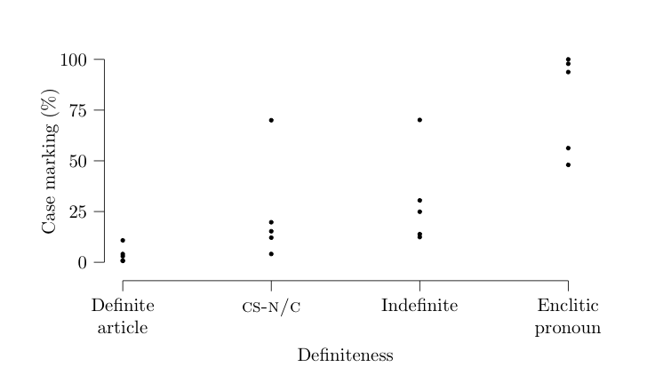
We insert this at the bottom of our tikzpicture environment. Now all we need to do is to define the \plotdata command so that all this actually does something. The beauty of this approach is that now we have all the structure we need and we can use of the resources of Tikz to turn them into a nice-looking plot. I will give two examples of how to do this, first with dots as a scatter plot and then with lines as a line plot.
First dots. In Tikz, coordinates are specified as (<x>,<y>). The command definition below takes the first argument as the y-coordinate on draws it on x=0. The second argument as the y-coordinate on x=1, etc. Since we specified the y\ units in the plot to reflect the properties of the data, it will come out just right.
\newcommand\plotdata[4]{
  \draw[fill=black] (0,#1) circle [radius=1pt];
  \draw[fill=black] (1,#2) circle [radius=1pt];
  \draw[fill=black] (2,#3) circle [radius=1pt];
  \draw[fill=black] (3,#4) circle [radius=1pt];
}
This gives the following:
Now lines. Here we want to connect these same four coordinates with a line.
\newcommand\plotdata[4]{
  \draw (0,#1) -- (1,#2) -- (2,#3) -- (3,#4);
}
This gives the following, which is what we want in this example:
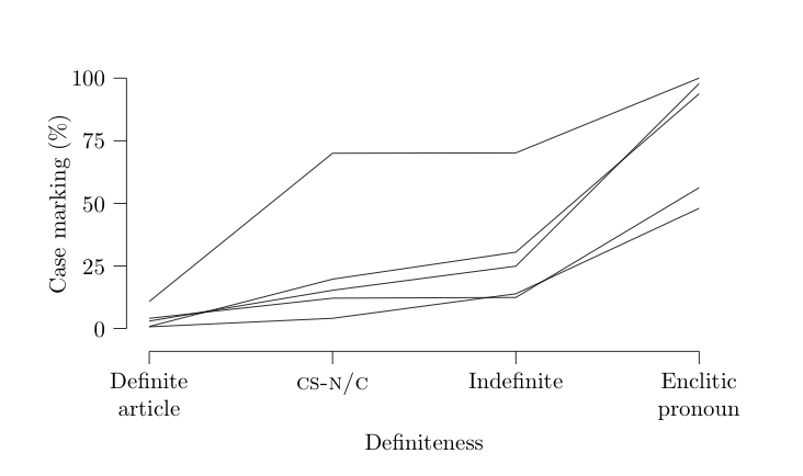
And there you have the basic idea.
Complete self contained example
\documentclass{article}
\usepackage{tikz}
\usepackage{calc}
\usepackage{kantlipsum}

% lengths for tikz plots
\newlength\plotheight % Height of plotting area
\setlength\plotheight{.2\textheight}
\newlength\plotwidth % Width of plotting area
\setlength\plotwidth{.7\textwidth}
\newlength\axissep % Space between plotting area and axis
\setlength\axissep{1em}
\newlength\tickl % Length of minor ticks
\setlength\tickl{2mm}
\newlength\ltickl % Length of major ticks
\setlength\ltickl{3mm}
\newlength\ylabsep % space between plotting area and y-label
\setlength\ylabsep{\axissep+\tickl+1.5em}
\newlength\xlabsep % space between plotting area and x-label
\setlength\xlabsep{\axissep+\tickl+1.5em}

\begin{document}

\kant[1]

\begin{figure}
\center
\def\maxy{100}%
\def\miny{0}%
\def\maxx{3}%
\def\minx{0}%
\def\xlab{Definiteness}%
\def\ylab{Case marking (\%)}%
\begin{tikzpicture}[
    y=\plotheight/(\maxy-\miny)
    , x=\plotwidth/(\maxx-\minx)]

    \useasboundingbox
        (-\axissep,-\axissep-\tickl-\xlabsep)
        rectangle  (\maxx,\maxy);

% y-axis
\draw (\minx-\axissep,\miny) -- (\minx-\axissep,\maxy);
% y-ticks
\foreach \x in {0,25,...,\maxy}
    {\draw (\minx,\x) ++ (-\axissep,0) -- ++ (-\tickl,0)
% y-ticklabels
	    node[anchor=east] {\x};}
% y-label
    \path  (\minx-\ylabsep, {(\miny+\maxy)/2}) node[align=center, rotate=90 ,anchor=south] {\ylab};

% x-axis
\draw (\minx,\miny) ++ (0,-\axissep) -- ++ (\maxx,0);

% x-ticks
\foreach \x in { 0, 1, 2, 3 }
    \draw (\x, \miny) ++ (0,-\axissep) -- ++ (0, -\tickl);
% x-ticklabels
      \node at (0,-\axissep-\tickl) [align=center,anchor=north ] {Definite\\article};
      \node at (1,-\axissep-\tickl) [anchor=north] {\textsc{cs-n/c}\vphantom{I}}; % \vphantom to align
      \node at (2,-\axissep-\tickl) [anchor=north] {Indefinite};
      \node at (3,-\axissep-\tickl) [align=center,anchor=north ] {Enclitic\\pronoun};

% x-label
    \path ({(\minx+\maxx)/2},\miny) ++ (0, -\xlabsep-\baselineskip)
    node[anchor=north] {\xlab};

% \newcommand\plotdata[4]{
%   \draw[fill=black] (0,#1) circle [radius=1pt];
%   \draw[fill=black] (1,#2) circle [radius=1pt];
%   \draw[fill=black] (2,#3) circle [radius=1pt];
%   \draw[fill=black] (3,#4) circle [radius=1pt];
% }

\newcommand\plotdata[4]{
  \draw (0,#1) -- (1,#2) -- (2,#3) -- (3,#4);
}

\plotdata{10.800}{70.000}{70.149}{99.999}
\plotdata{2.967}{15.277}{24.902}{97.826}
\plotdata{0.809}{19.718}{30.496}{93.750}
\plotdata{4.072}{12.121}{12.413}{56.249}
\plotdata{0.684}{4.081}{13.872}{47.999}

\end{tikzpicture}
\caption{Predicted case marking by types of definiteness}
\end{figure}

\kant[2]

\end{document}
-
In Vim, for example, we can visually select the csv data and do this
:s/^/\\plotdata{/g, this:s/,/}{/g, and this:s/$/}/g, and there you have it. If you are doing your statistics in\ R I find it more convenient to write a script that transform the data into LaTeX commands directly. ↩